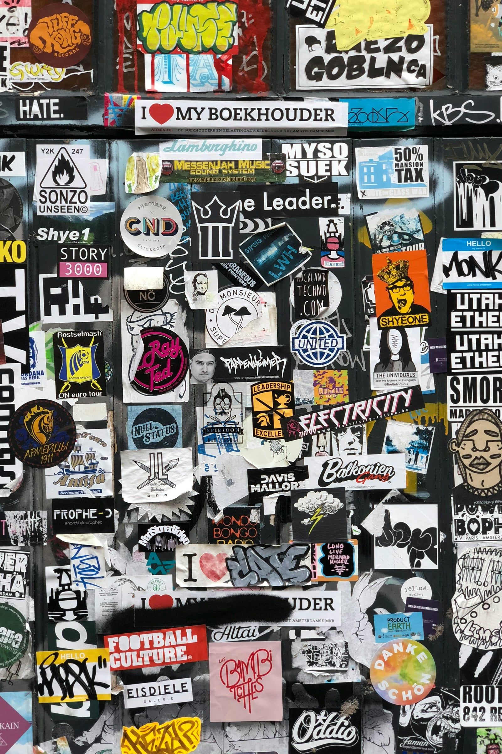
Think of the logos you recognise instantly. Chances are they’re surprisingly simple. That’s no accident. Behind every lasting logo is a set of principles that designers come back to again and again. Here’s what we look for when creating a logo for a client.
Simplicity
A logo has to work at a glance: on a passing van, in a crowded social feed, or as a tiny icon on a phone screen. Simple shapes and limited detail make a mark easier to recognise and remember. If a logo needs explaining, it’s probably trying to do too much.
Memorability
Simplicity helps, but a great logo also has something distinctive about it: an unexpected shape, a clever use of negative space, or a distinctive typeface. The aim is that someone could roughly sketch it from memory after seeing it a few times.
Versatility
Your logo will appear in more places than you might imagine: business cards, websites, signage, embroidered uniforms, social media avatars, exhibition stands, invoices and email signatures. A great logo works:
- in full colour, single colour and black and white;
- at very large and very small sizes;
- on light and dark backgrounds;
- in square, horizontal and stacked layouts.
That’s why we always supply a family of logo versions rather than a single file, and test every design across real-world applications before it’s signed off.
Appropriateness
A logo should feel right for its audience and sector. Playful, rounded lettering might be perfect for a children’s nursery and completely wrong for a law firm. That doesn’t mean following clichés (not every accountant needs a tick, and not every builder needs a roof). It means understanding the impression you want to create, and designing towards it.
Timelessness
Trends come and go quickly. A logo built entirely around this year’s fashionable gradient or font may look dated in a couple of years. The best logos feel contemporary without being tied to a moment, so they can serve a business for a decade or more with only small refinements.
It doesn’t have to say everything
One of the most common mistakes is trying to show everything a business does in one symbol. Your logo is a signature, not a brochure. Its job is to identify you and create the right feeling. The rest of your brand, from colours and photography to tone of voice and messaging, tells the full story.
How we approach logo design
Every logo project starts with listening: who you are, who your customers are, who you compete with, and where you want to be in five years. From there we explore a range of concepts, refine the strongest, and test them in real-world mock-ups before delivering a complete set of files for print and digital use.
Starting a new business or ready to refresh an old logo? Get in touch to talk about a logo that will serve you for years to come.