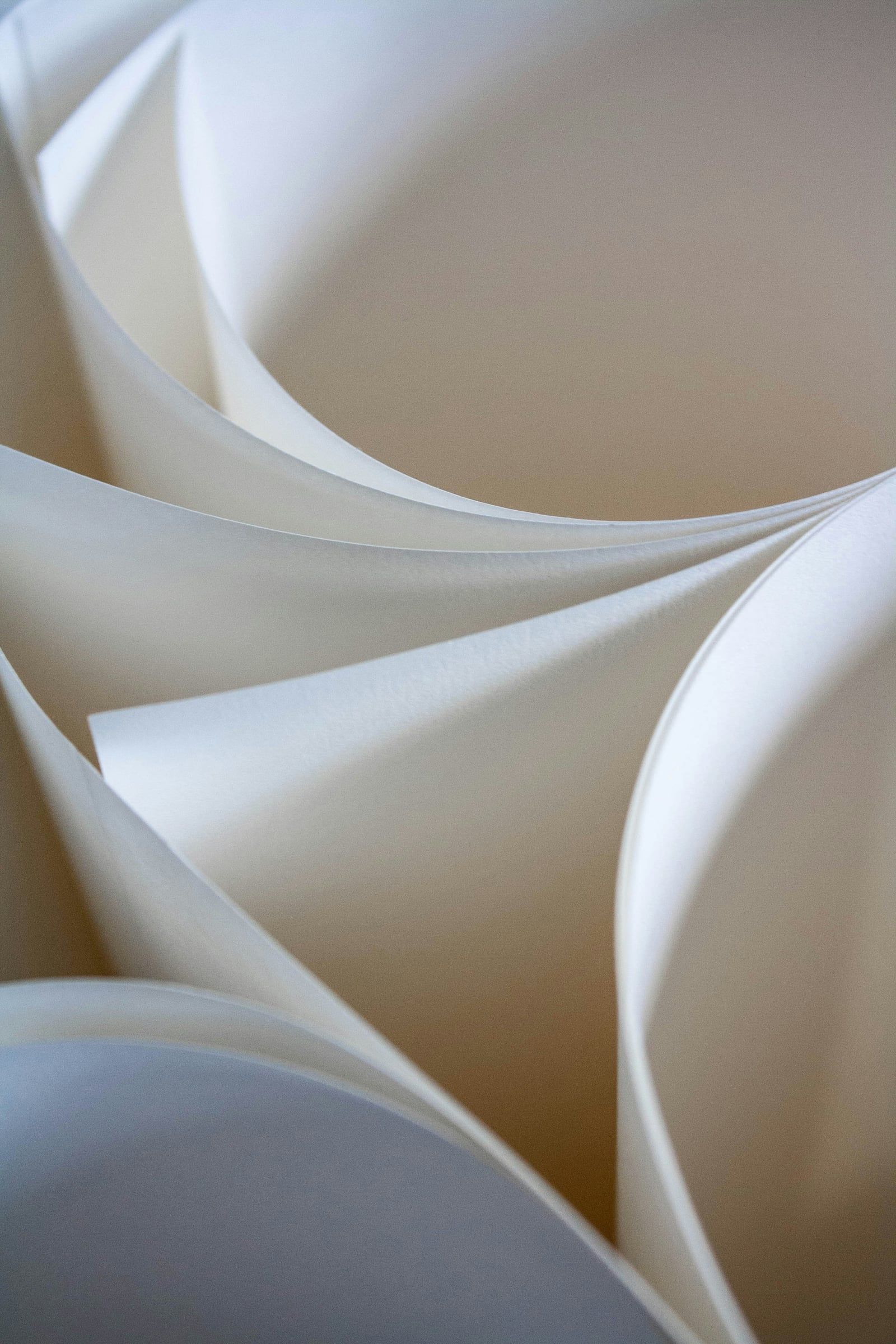
The moment someone picks up your brochure, they’ve formed an impression before reading a single word. A heavy, silky cover suggests quality and care. A thin, flimsy sheet can undermine even the most beautiful design. Paper choice is one of the most underrated decisions in print, so here’s what to consider.
Understanding paper weight (GSM)
Paper weight is measured in grams per square metre (GSM). As a rough guide:
| Weight | Typical use | Feel |
|---|---|---|
| 90–130gsm | Letterheads, inner pages of long documents | Light, everyday |
| 150–170gsm | Inner pages of brochures, flyers | Substantial without bulk |
| 250–300gsm | Brochure covers, postcards | Firm, premium |
| 350gsm+ | Business cards, presentation folders | Rigid, luxurious |
Many brochures pair a heavier cover with lighter inner pages. It feels premium in the hand while keeping the document easy to open, fold and post. Speaking of post: weight affects postage costs, so it’s worth checking before committing to a large mailing.
Coated or uncoated?
Coated papers have a smooth surface layer that holds ink on top of the sheet, which keeps images crisp and colours vivid. They come in three main finishes:
- Gloss: shiny and punchy. Great for photography-led brochures, holiday or property marketing.
- Silk: a soft sheen that balances image quality with readability. The most popular all-rounder.
- Matt: low glare and understated. Ideal for text-heavy documents and a contemporary, refined look.
Uncoated papers absorb more ink, giving a softer, more natural result. They feel tactile and authentic, and they’re easy to write on, which makes them a good fit for artisan brands, hospitality, wellbeing businesses and forms people need to fill in. Photographs will appear slightly less saturated, so we adjust artwork accordingly.
Finishing touches that make a difference
Once you’ve chosen your stock, finishes can lift a brochure further:
- Lamination (matt, gloss or soft-touch) protects covers from scuffs. Soft-touch has a velvety feel people can’t stop stroking.
- Spot UV adds a glossy raised highlight to a logo or headline.
- Foiling brings metallic shine in gold, silver, copper or colour.
- Embossing and debossing create raised or pressed-in detail you can feel.
Used sparingly, these finishes turn a brochure into something people keep.
Think about sustainability
More clients now ask about environmental impact, and their customers notice too. Look for FSC®-certified or recycled stocks, and consider whether lamination is necessary, as it can make recycling harder. Uncoated recycled papers have come a long way and can look and feel beautiful.
Match the paper to the purpose
Ask yourself a few practical questions. Will it be handed out at an event, posted, or left on a reception desk? Does it need to survive months of handling? Will people write on it? Is your brand bold and glossy, or calm and natural? The answers usually point clearly to the right stock.
Not sure where to start?
We’re always happy to share paper samples and talk through options before anything goes to print. We design every brochure with its final stock in mind, from colour settings to binding, so the finished piece looks exactly as intended.
Planning a brochure? Get in touch and we’ll help you choose a stock that does your brand justice.